

CoD: Mobile | How do we relay the core experience?
Game Design
The Intended Experience
The Intended Experience

While game design develops the intended player experience with the overall gameplay flow, features, etc., this might not always translate well to the player.

UX/UI Design
The Intended Experience
The Perceived Experience

Ensures that the game design’s intention matches the player’s actual perception of the game, through easy onboarding, habit development & intuitive design.
Why The “Perceived Experience” Matters
Executive Summary
Main Takeaways from Retention & Engagement Analysis
1
Onboarding & Early Progression Clarity
Defining Success Metrics
Business KPIs to Monitor UX Improvements
Tutorial Overview – Current State
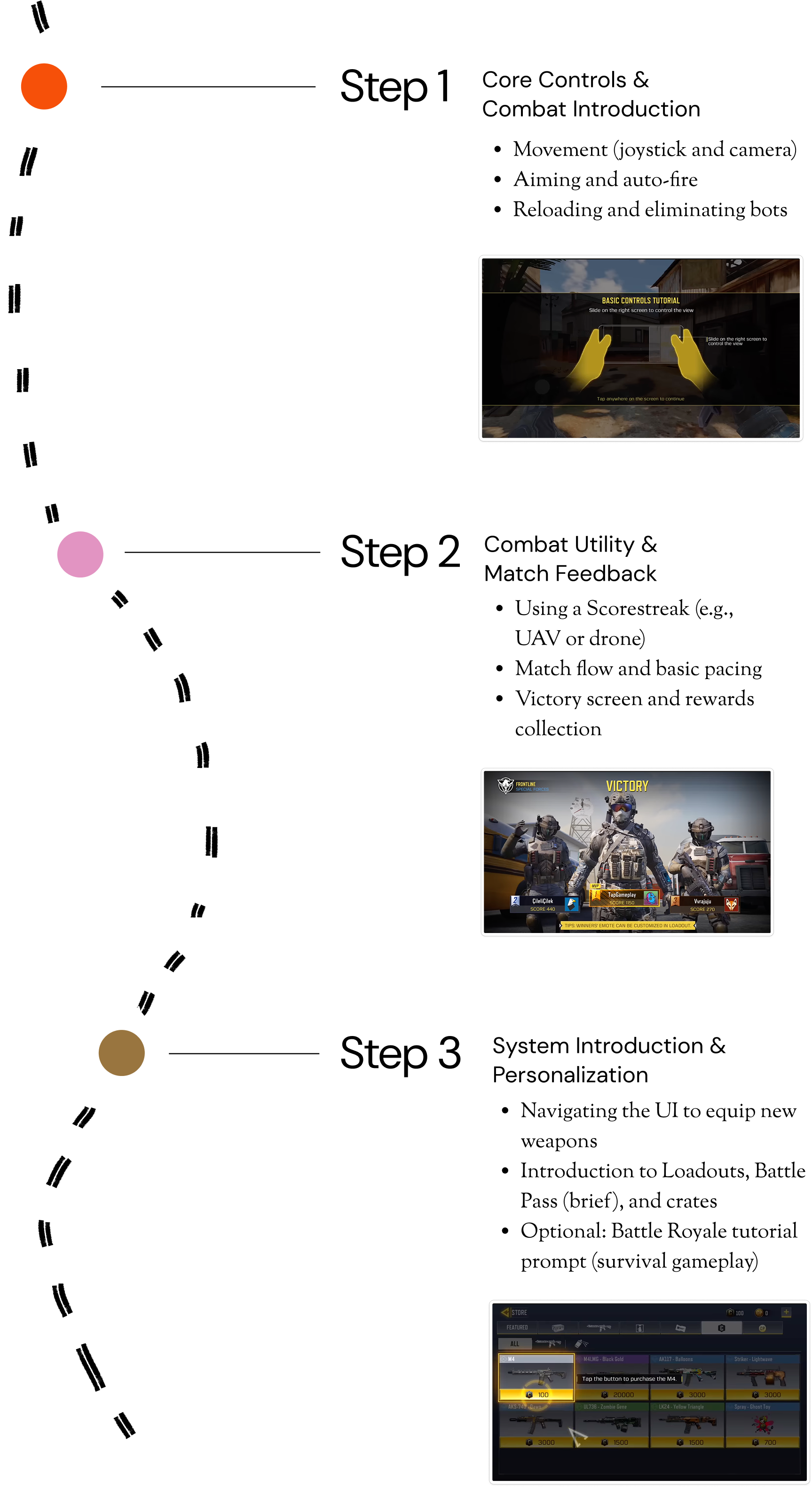
1st Gameplay Tutorial
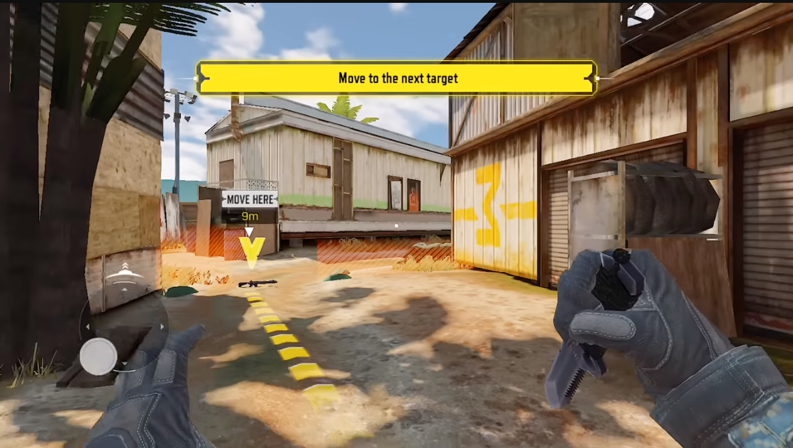
A controlled game environment outside of any game-mode designed to introduce basic core combat controls & skills
2nd Gameplay Tutorial
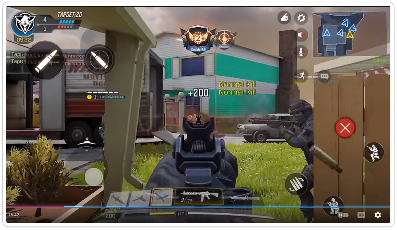
A controlled game environment outside of any game-mode designed to introduce basic core combat controls & skills
2
Loadout Screen & Gunsmith Accesibility
Defining Success Metrics
Business KPIs to Monitor UX Improvements
3
Reward Clarity & Motivational Design
Defining Success Metrics
Business KPIs to Monitor UX Improvements
CoD: Mobile | How do we relay the core experience?
Game Design
The Intended Experience
The Intended Experience

While game design develops the intended player experience with the overall gameplay flow, features, etc., this might not always translate well to the player.

UX/UI Design
The Intended Experience
The Percieved Experience
Ensures that the game design’s intention matches the player’s actual perception of the game, through easy onboarding, habit development & intuitive design.
Why The “Perceived Experience” Matters
Retention
The ability to keep players coming back over time by providing consistent value and motivation to return.
Engagement
The measure of how actively players interact with the game’s systems, content, and mechanics.
Executive Summary
Main Takeaways from Retention & Engagement Analysis
1
Onboarding & Early Progression Clarity
Defining Success Metrics
Business KPIs to Monitor UX Improvements
+10-15%
Increase in full tutorial completion (within the first 15 minutes)
+5%
Improvement in D1 retention rate
-10%
Reduction rate in players quitting before their first real match
Tutorial Overview – Current State
1st Gameplay Tutorial
A controlled game environment outside of any game-mode designed to introduce basic core combat controls & skills
2nd Gameplay Tutorial
A controlled game environment outside of any game-mode designed to introduce basic core combat controls & skills
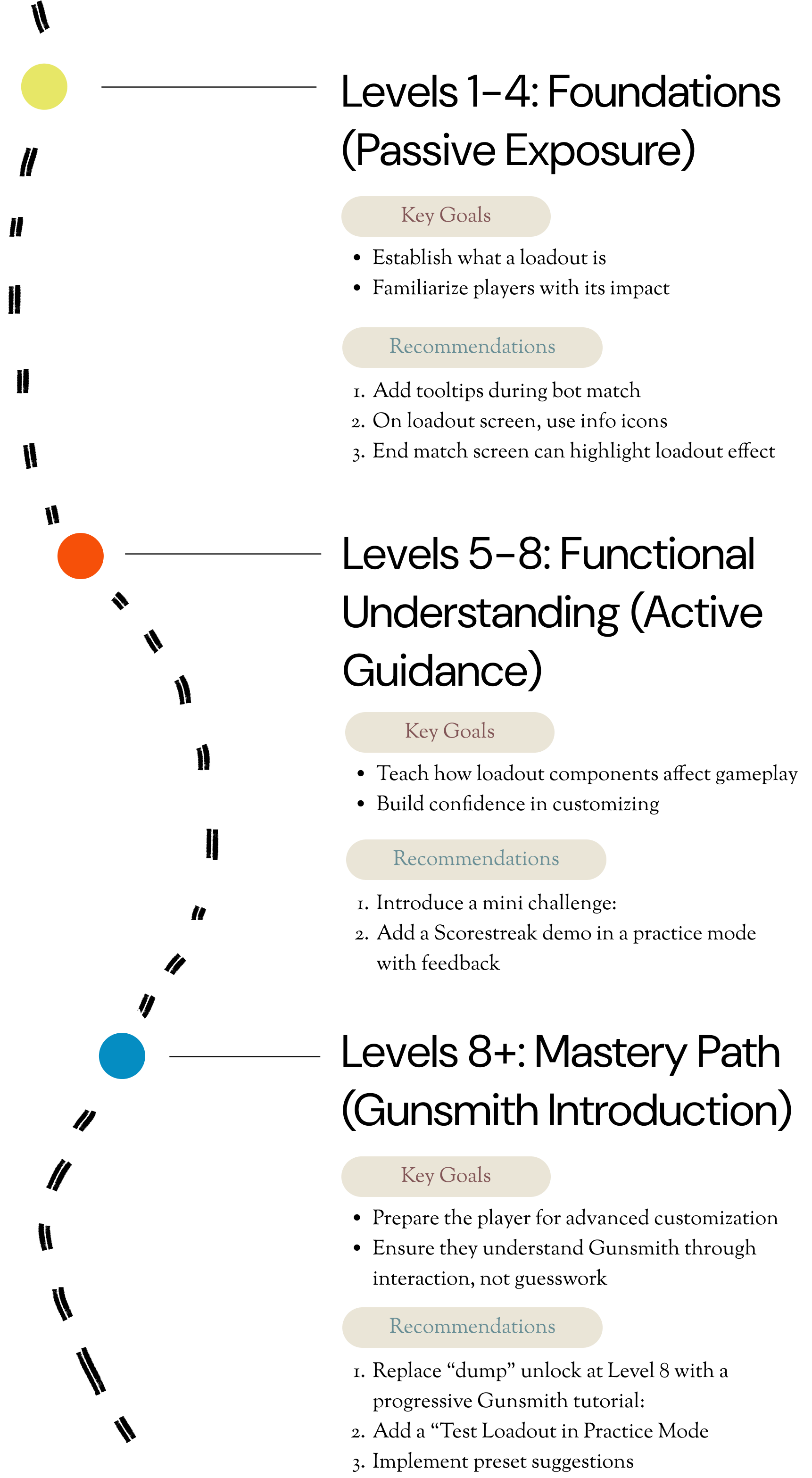
2
Loadout Screen & Gunsmith Accesibility
Defining Success Metrics
Business KPIs to Monitor UX Improvements
Louadout Engagement
Increased time spent in loadout due to tutorials, testing modes, and presets
Churn at Level 8-10
Decrease in player drop-off after Gunsmith unlock due to reduced cognitive overload
Feature Adoption
Increase in % of users equipping perks, scorestreaks, attachments, and other aspects of Loadout & Gunsmiths menu
3
Reward Clarity & Motivational Design
Defining Success Metrics
Business KPIs to Monitor UX Improvements
↑ DAU
Systems like login calendars, visible mission trackers, and personalized goal reminders help players form habits and return daily.
↑ Session Length
When players see visible progress bars , they’re more likely to stay in the game longer.
↑ Battle Pass Conversion
When players clearly understand what they’re working toward, they’re more likely to see value in upgrading for faster rewards.
- Reminder (Cue)
- Routine (Action)
- Reward (Outcome)
CoD: Mobile | How do we relay the core experience?

While game design develops the intended player experience with the overall gameplay flow, features, etc., this might not always translate well to the player.


Ensures that the game design’s intention matches the player’s actual perception of the game, through easy onboarding, habit development & intuitive design.
Why The “Perceived Experience” Matters
Retention
The ability to keep players coming back over time by providing consistent value and motivation to return.
Engagement
The measure of how actively players interact with the game’s systems, content, and mechanics.
Executive Summary
Main Takeaways from Retention & Engagement Analysis
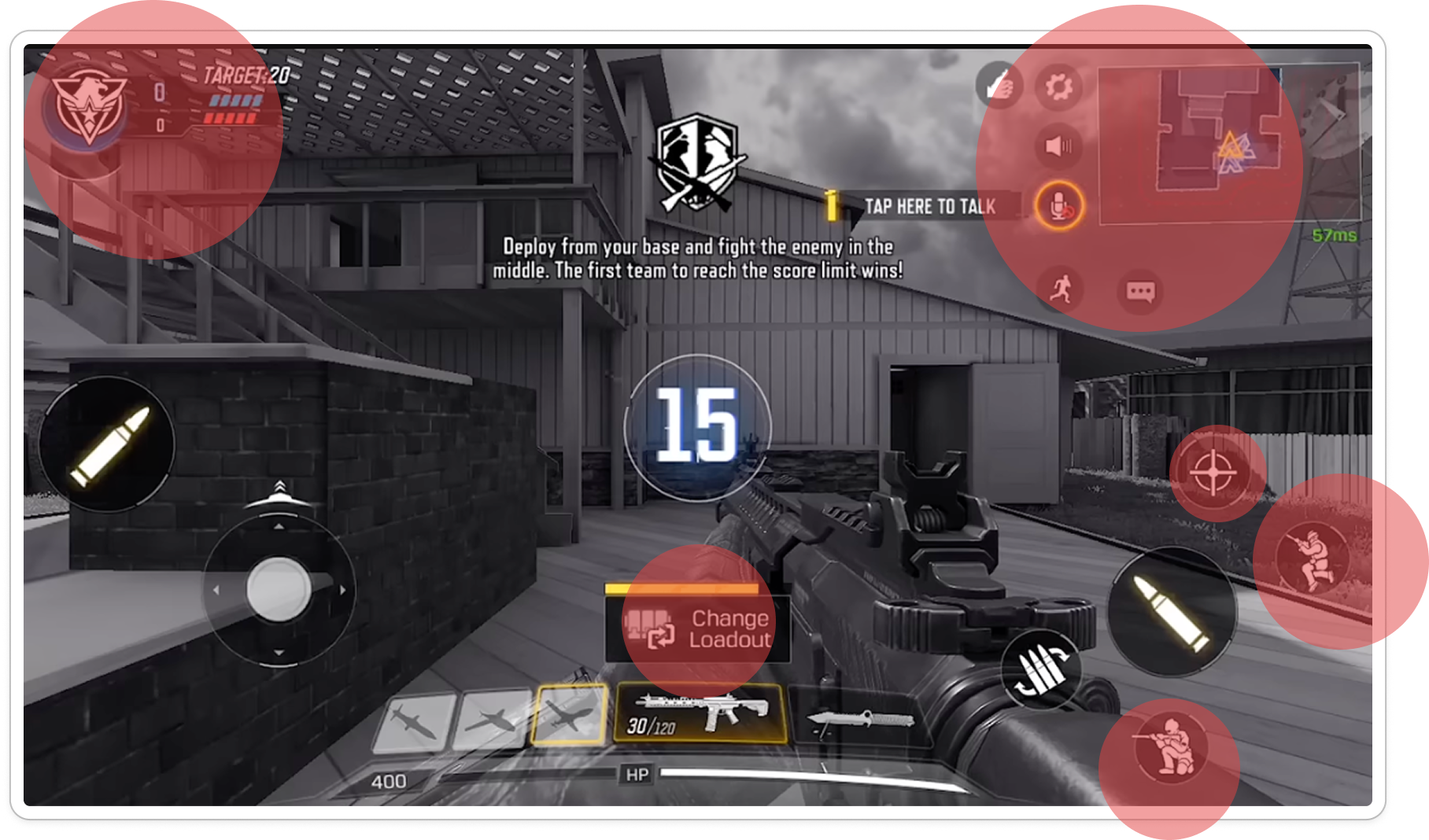
Onboarding & Early Progression Clarity
High Priority
New players feel overwhelmed by the UI complexity, unclear mode choices, and poorly guided progression.
Opportunity Areas:
- Streamline the tutorial flow for gameplay
- Simplify menus and notifications
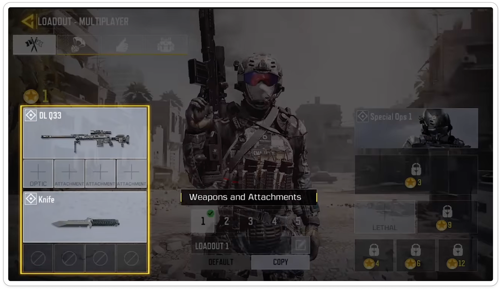
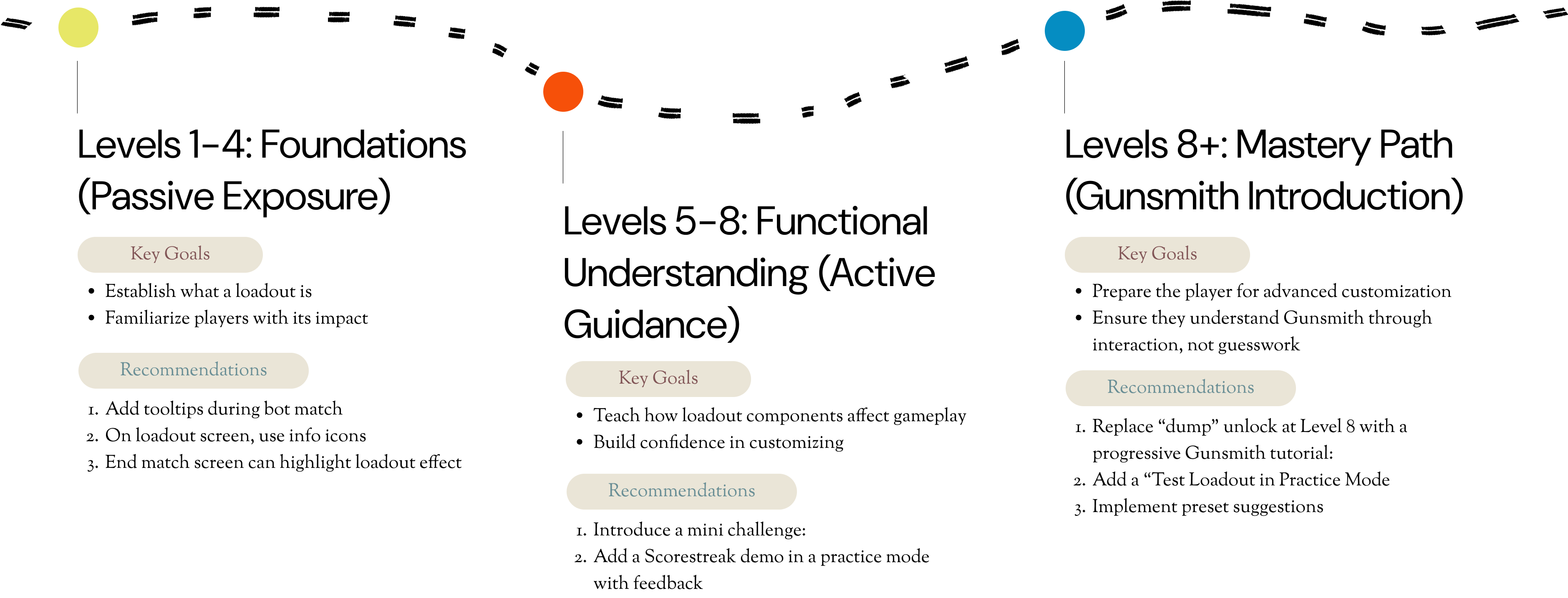
Loadout Screen & Gunsmith Accessibility
Medium Priority
The Gunsmith and loadout systems, while deep, are intimidating and confusing for new or casual players to grasp.
Opportunity Areas:
- Design a tiered progression while learning about loadout
- Add simplified presets or auto-build options
Reward Clarity & Motivational Design
Low Priority
Players receive too many rewards from too many sources, without visibility or motivation to chase specific goals.
Opportunity Areas:
- Create a centralized “Reward Tracker” hub
- Visualize player objectives & goals clearly
1
Onboarding & Early Progression Clarity
Defining Success Metrics
Business KPIs to Monitor UX Improvements
+10-15%
Increase in full tutorial completion (within the first 15 minutes)
+5%
Improvement in D1 retention rate
-10%
Reduction rate in players quitting before their first real match
Tutorial Overview – Current State
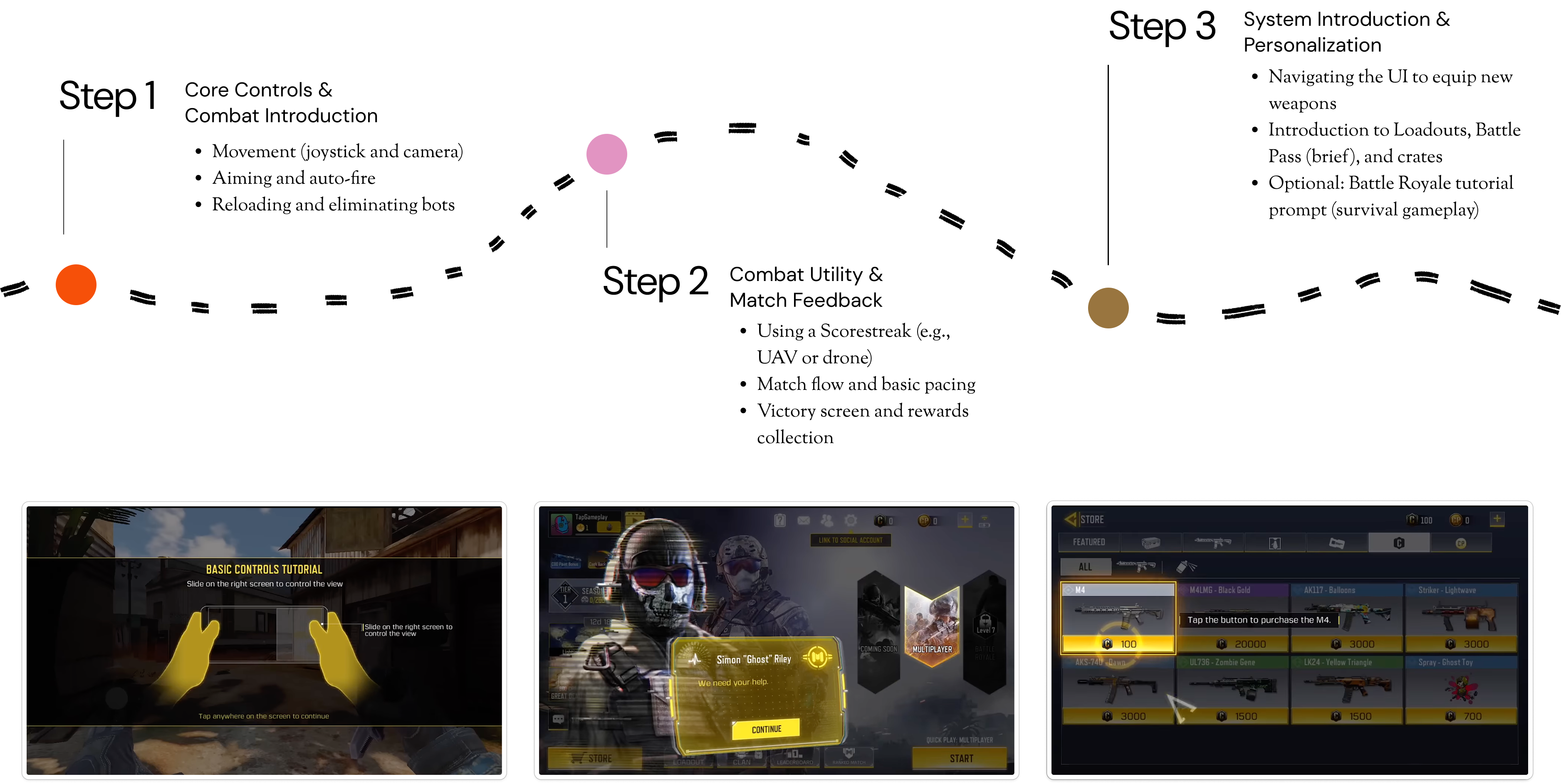
1st Gameplay Tutorial
A controlled game environment outside of any game-mode designed to introduce basic core combat controls & skills
2nd Gameplay Tutorial
A controlled game environment outside of any game-mode designed to introduce basic core combat controls & skills
2
Loadout Screen & Gunsmith Accesibility
Defining Success Metrics
Business KPIs to Monitor UX Improvements
Louadout Engagement
Increased time spent in loadout due to tutorials, testing modes, and presets
Churn at Level 8-10
Decrease in player drop-off after Gunsmith unlock due to reduced cognitive overload
Feature Adoption
Increase in % of users equipping perks, scorestreaks, attachments, and other aspects of Loadout & Gunsmiths menu
3
Reward Clarity & Motivational Design
Defining Success Metrics
Business KPIs to Monitor UX Improvements
↑ DAU
Systems like login calendars, visible mission trackers, and personalized goal reminders help players form habits and return daily.
↑ Session Length
When players see visible progress bars , they’re more likely to stay in the game longer.
↑ Battle Pass Conversion
When players clearly understand what they’re working toward, they’re more likely to see value in upgrading for faster rewards.
- Reminder (Cue)
- Routine (Action)
- Reward (Outcome)