
A process-oriented approach.
1 – Understanding the Player Journey
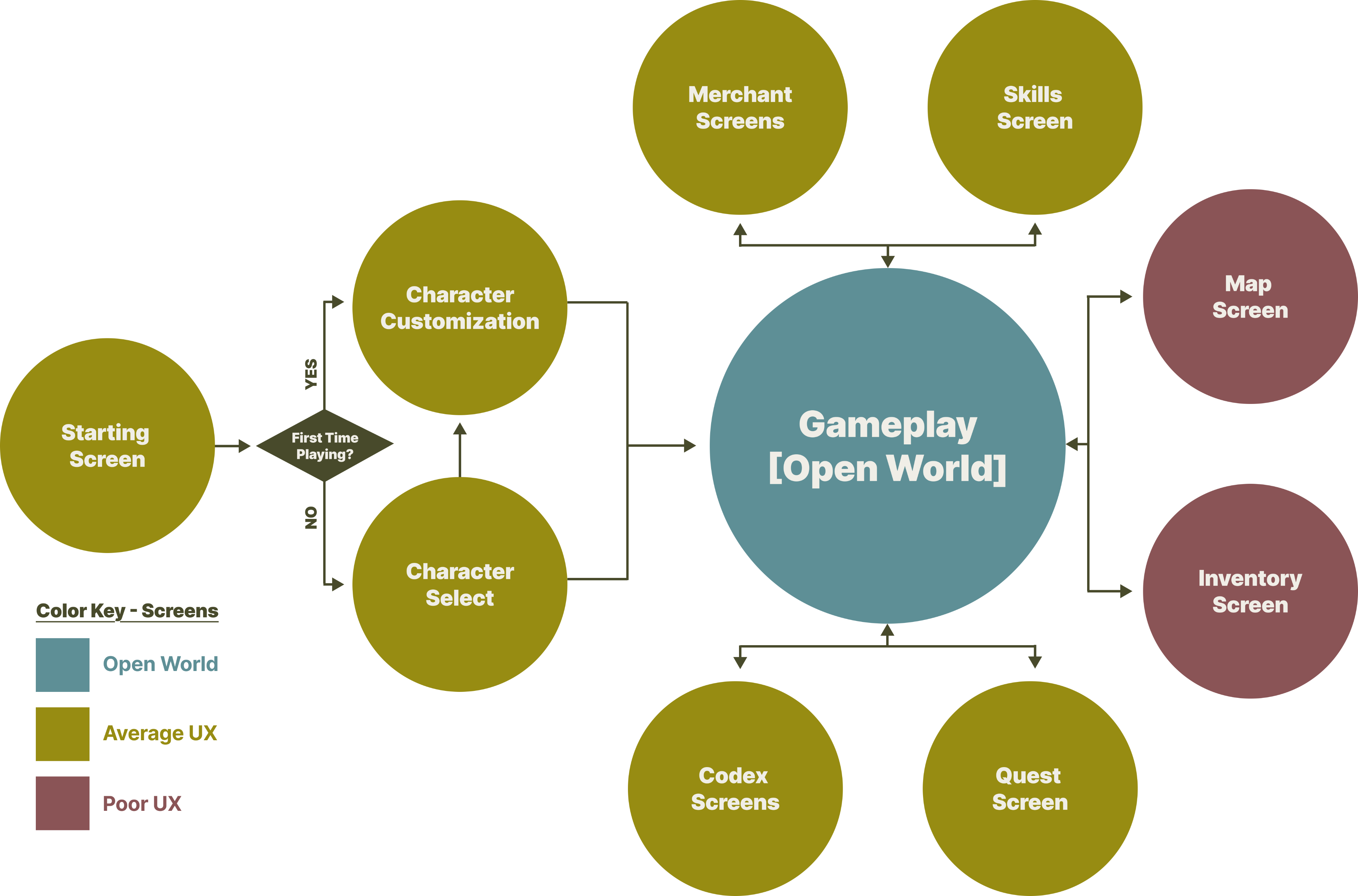
Mapping out the player journey is essential to identify key screens and interactions for evaluation, ensuring UX improvements are targeted towards the areas that will have the most substantial impact.
Experience Evaluation #1 – Map Screen
Experience Evaluation #2 – Inventory Screen
A process-oriented approach.
1 – Understanding the Player Journey
Mapping out the player journey is essential to identify key screens and
interactions for evaluation, ensuring UX improvements are targeted towards
the areas that will have the most substantial impact.
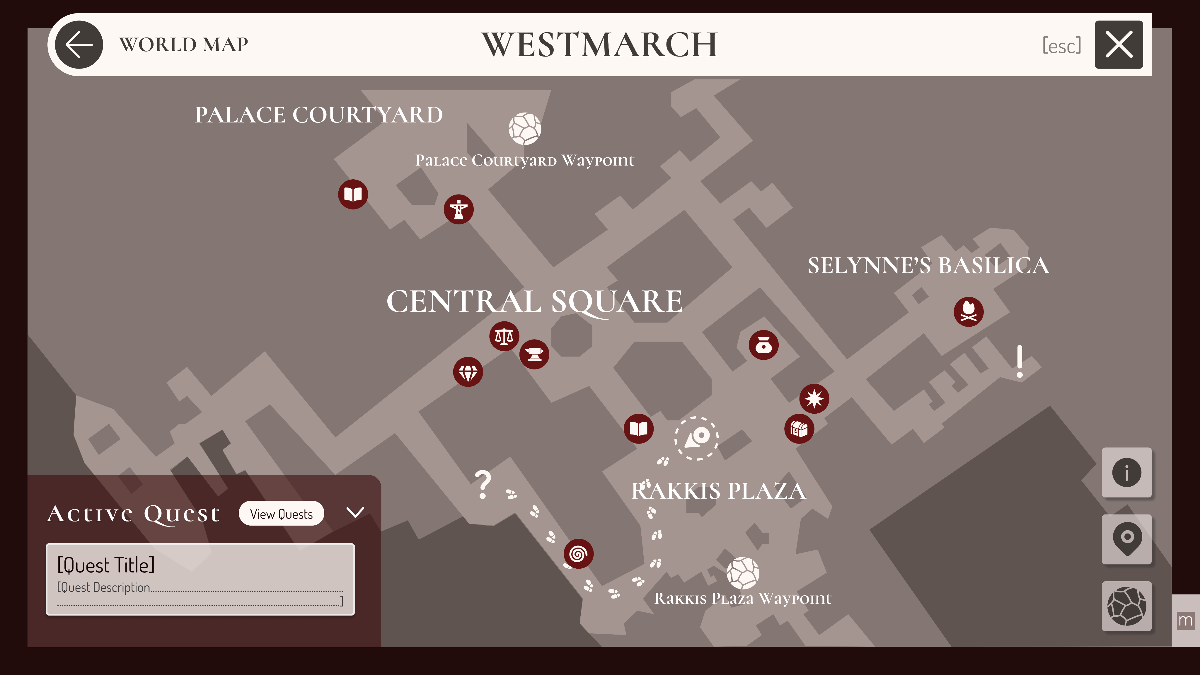
Experience Evaluation #1 – Map Screen
Usability
Desirability
Scalability
Rating – Low
Rating – Medium
Rating – Medium
- Low contrast and visibility between content & background
- Lack of coordination between map and quest objectives
- Current location indicator is unclear
- Lack of an icon key overwhelms and confuses new players
- Parchment-style design enhances immersion and feels true to the Diablo universe.
- Lack of personalization (custom markers) discourages a deeper player connection.
- Zooming in on densely packed areas feels clunky, making navigation less appealing.
- The map’s separation by acts and regions allows Blizzard to gradually roll out content without overwhelming players.
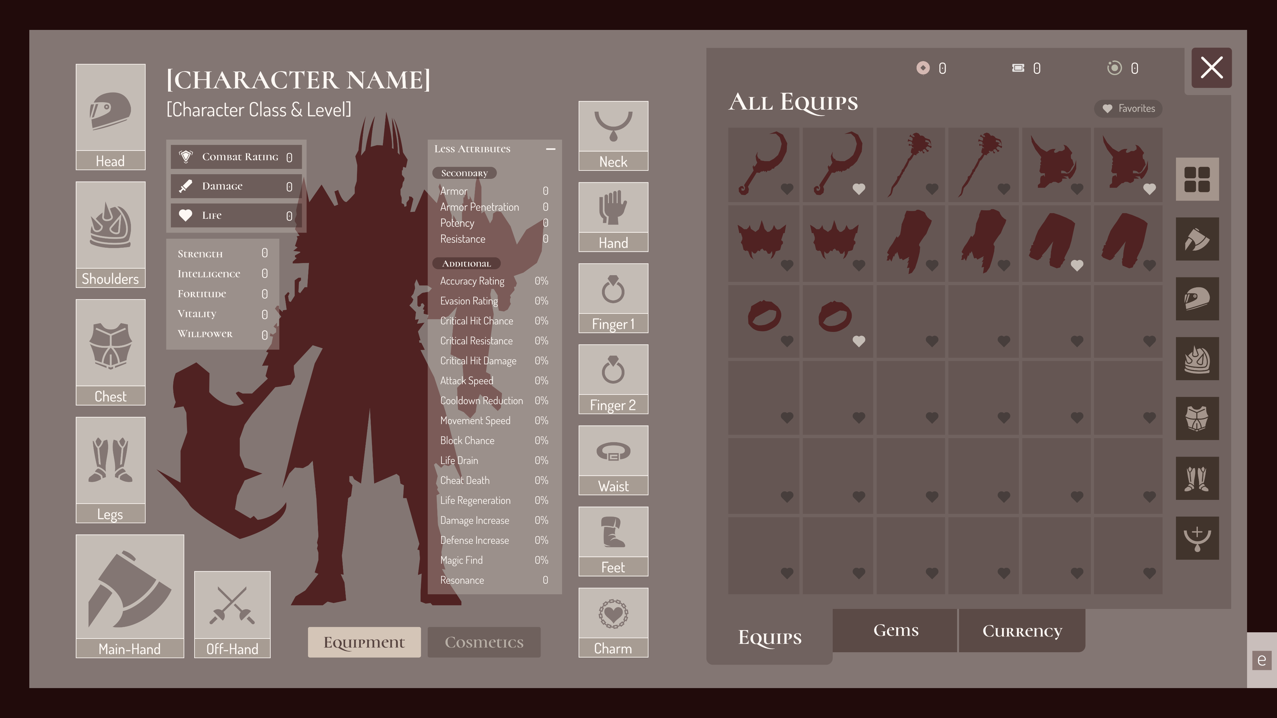
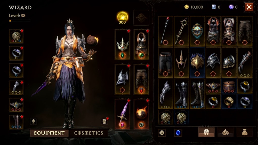
Experience Evaluation #2 – Inventory Screen
Usability
Desirability
Scalability
Rating – Low
Rating – Medium
Rating – High
- Poor categorization & organization of weapons, armor, etc.
- Character stats are hidden and not immediately visible to the player as they equip new items
- Poor labelling – equips, equip active slots, gems, currency, etc.
- Player is able to see their character change appearance live as they equip new items, providing a sense of satisfaction
- The UI lacks flair and feels more like a spreadsheet than a fantasy loot hoard
- Game encourages players to sell their unused items, preventing an overcrowded inventory
- Endless options for new items and interactions with their character
A process-oriented approach.
1 – Understanding the Player Journey
Mapping out the player journey is essential to identify key screens and
interactions for evaluation, ensuring UX improvements are targeted towards
the areas that will have the most substantial impact.
Experience Evaluation #1 – Map Screen
Usability
Desirability
Scalability
Rating – Low
Rating – Medium
Rating – Medium
- Low contrast and visibility between content & background
- Lack of coordination between map and quest objectives
- Current location indicator is unclear
- Lack of an icon key overwhelms and confuses new players
- Parchment-style design enhances immersion and feels true to the Diablo universe.
- Lack of personalization (custom markers) discourages a deeper player connection.
- Zooming in on densely packed areas feels clunky, making navigation less appealing.
- The map’s separation by acts and regions allows Blizzard to gradually roll out content without overwhelming players.
Experience Evaluation #2 – Inventory Screen
Usability
Desirability
Scalability
Rating – Low
Rating – Medium
Rating – High
- Poor categorization & organization of weapons, armor, etc.
- Character stats are hidden and not immediately visible to the player as they equip new items
- Poor labelling – equips, equip active slots, gems, currency, etc.
- Player is able to see their character change appearance live as they equip new items, providing a sense of satisfaction
- The UI lacks flair and feels more like a spreadsheet than a fantasy loot hoard
- Game encourages players to sell their unused items, preventing an overcrowded inventory
- Endless options for new items and interactions with their character